


Talking About Colour with Ana Saiao
24 Jun 2019
As a stalwart regular among the interior design scene, the founder of Colour Palette, Ana Saiao's journey to certified colour connoisseur is one filled with curved turns, strategic risks and conventional barriers.
Battling against the general perception of what it means to have a ‘successful career in Portugal’, her passion for colour and design, and sharing that with others, was a secondary focus to her pharmaceutical career where she forged a successful name for herself as a lecturer and PKPD assessor at Infarmed (the Portuguese ‘TGA’). Tired of living in monotone, Ana’s hurrah moment arrived eight years ago when she relocated to Australia to finish a PhD in Pharmacokinetics. It wasn’t long before Ana resumed the creative journey imagined by her younger self and applied for a Diploma in Interior Design and Colour – she bravely quit her PhD, resigned from her then job and started Colour Palette, successfully forging a path within the design industry that is no longer a pigment of her imagination!
The breadth of your experiences, having worked in the pharmaceutical industry prior to making the transition to design and colour, has provided you with a unique viewpoint – the ability to view colour as both a creative and scientific discipline. Can you talk us through what you mean by this?
Usually, people see colour as a creative discipline however there is definitely a scientific ground to it. I like to understand the meaning of things not just ‘use my eye for colour’ or ‘trust my instinct’. We can learn how to ‘read’ colour and understand the principles behind it. After finishing my studies, I realised that there was a gap in my knowledge, so I decided to do my own research on colour. I can now understand colour and that is what I teach in my training programs.
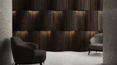
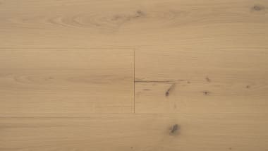
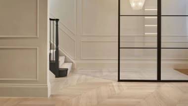
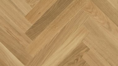
Natural, warm floors are a popular choice for many clients and homeowners. Can you provide some advice on which colours would best complement a lighter floor?
When selecting colour, in general, there are three important things to consider: hue (‘colour’ itself), tonal value (how light or dark the colour is) and chroma (how saturated the colour is). For a residential space, my advice would be using a low saturated (soft) colour with a high to intermediate tonal value. A very trendy colour at the moment is a soft green based-grey. It complements a natural warm floor beautifully!

The natural tones of Venture Plank HW961 Amendo beautifully complement the light-mid grey aesthetic of this residential home.
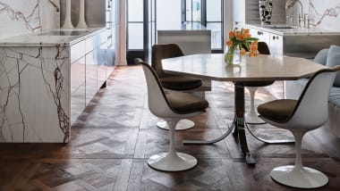
Any guidance when working with a dark floor? How can someone make use of space and lighting to achieve the illusion of a larger area?
When working with a dark floor my advice would be to check the contrast in tone between the floor and any piece of furniture or rug placed on it. You should avoid having the same tonal value between both, otherwise, you will have the perception that the furniture or rug ‘is part’ of the floor. I like to call it the ‘chameleon’ effect. You can create the illusion of a larger area by using soft (low saturated) colours with a high (light) tonal value. Lighter colours will reflect more light making the room feel bigger.
How influential do you believe colour to be on an individual’s emotions?
The human response to colour is very complex but I believe colour has a major impact on an individual’s emotions. Some colours make us feel sad, others happy or relaxed. That is why [it’s] so important to understand the individual needs of a client when specifying a colour for a room.
Can you explain the theory behind ground subtraction? Can it be avoided?
Ground subtraction can apply to any of the three properties of colour: hue, value and chroma, and implies that we have a ‘ground’ that carries a colour. It can be a cushion on a sofa, a piece of art on the wall or a rug on the floor, etc. Let's focus on hue in this example and consider a dark floor as the ground and a high value (light) rug as the carrier. The floor (ground) is going to take the aspect that it shares with the carrier (hue). Therefore, by taking away ‘hue’ from the rug, the rug is going to look lighter than it actually is. We cannot avoid ground subtraction. The main thing is to be aware of it when selecting flooring, wall colours, furniture, window covering and homewares for the house!
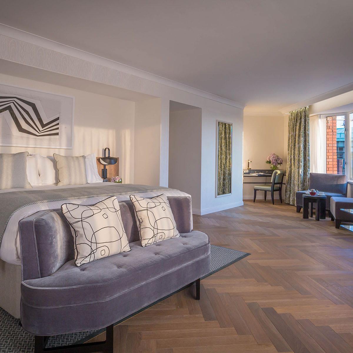
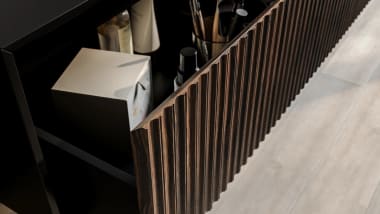
To combat the perceived harshness of a darker floor, invest in furniture in lighter shades and accessories in soft textural accents. Featuring our
Italian Collection HW16007 Notte Herringbone.
Sometimes, a client can have their mind set on a specific colour that just doesn’t work with the overall palette. What are some of your tips when it comes to approaching such a situation?
The best approach to deal with this situation is to explain to the client why that colour doesn't work with the overall palette. The designer needs to be able to articulate and demonstrate the reason why that combination doesn't work. Knowledge is the key!
What’s a common colour myth that you often come across?
We cannot combine red and green. This is totally wrong! With the right tints and shades, these two colours can look beautiful together.
As a colour consultant, do you have a favourite colour?
I do. Green!
Any final pieces of advice that you can share with designers and architects in the industry?
Don’t be afraid of taking risks. I think designers and architects are scared of moving away from their ‘comfort’ zone. The right knowledge and resources will improve their confidence and ability to think outside the box!